
logo design
brand identity refresh
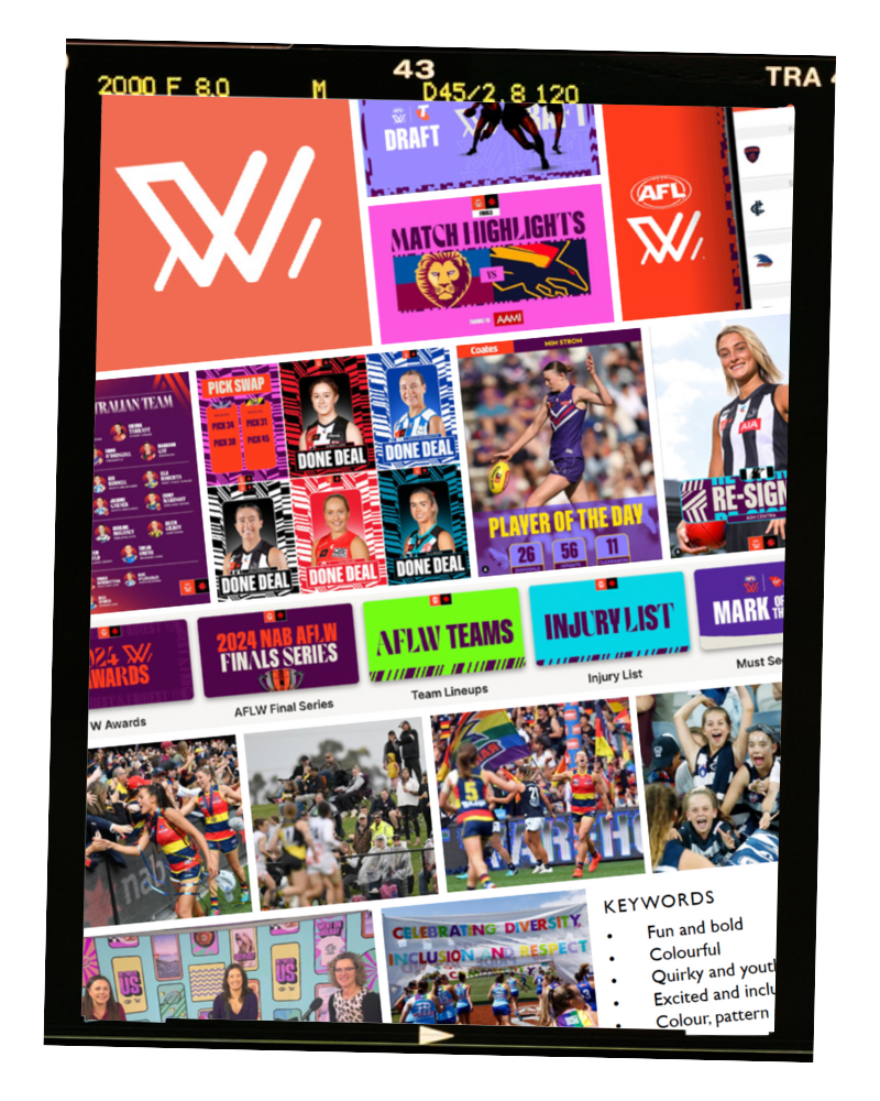
brand collateral
social media design
*video clips are property of the AFLW* - edited by ollie allen creative.
This project is a conceptual reimagining of the AFLW logo and brand identity.
The AFLW is often looked down upon as the lesser of the two AFL codes. Through this project, I aimed to refresh the AFLW brand while creating a solution that unites the AFL and AFLW competitions, lessening the cultural divide through a visual language shift.
I aimed to align the AFLWs own and external perceptions, creating a brand that feels confident, mature, professional and worthy of equal respect and notoriety. By creating a stronger visual link between the AFL and AFLW, I aimed to leverage the success and reputation of the AFL to gain respect, understanding and recognition of the AFLW as a serious and competitive competition.
current brand research
The AFLW’s brand personality is fun, bold and vibrant. Clashing colours, shapes and typography are a core part of the brand and create a disruptive aesthetic, desiring a rebellious tone. Photography shown on their social media is often smiley, casual and unedited, with action shots scattered between. The boldness of the current branding is interesting, and I believe it is more exciting and better representative of the live brand experience than the AFL’s patriotic colour scheme, however, these same ‘fun’ aspects of the brand personality visually undermine the professionalism and strength of the women’s competition.
In contrast, the men’s competition takes a much more serious tone, with a competitive, sharp and elite-focused brand personality, supported by a sleek and muted visual presence, allowing the players and clubs to be the main subject focus. Photography shown on their social media is often athleticism based, with plenty of action shots and player celebrations refined by powerful photo editing techniques. This creates an aura of respect and admiration towards the competition and the athleticism of the athletes, whilst the casual nature of the AFLW’s photography style continues to undermine these qualities.

current AFLW logo + brand moodboard
The AFLW desires to appeal to sports fans within Australia and should have leveraged the loyal audience of the AFL by closer aligning themselves with their long established visual identity. However, the stark contrast in visuals and perceived brand personality results in further isolation of the women’s competition. The ‘disruptive’ and ‘rebellious’ aspects of their visual tone unintentionally reiterates the perceived ‘misplacement’ of the women’s competition, resulting in a greater divide between the two competitions in an already tumultuous social environment affected by sexism, misogyny and a historical lack of gender equality in sport.
Following the seven year development of the women’s competition, the brand requires a refresh to re-establish it’s identity as a strong, stable and professional competition, demanding recognition from all sports fans.
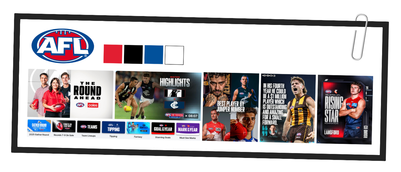
current AFL brand moodboard (for comparison)
creative strategy
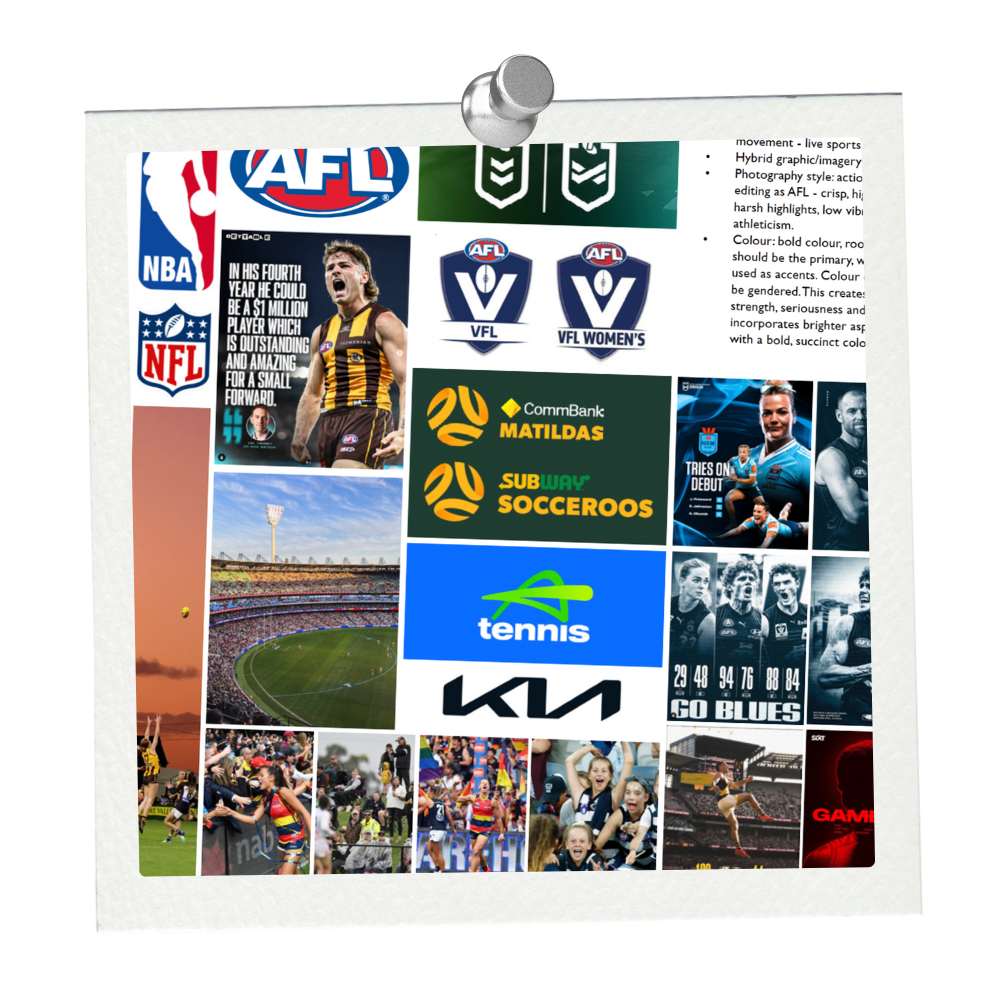
I aim to retain and engage the current AFLW supporter base, whilst leveraging the AFL supporter base and brand credibility through a more united ‘one brand’ perception. The overall tone will reflect strength and movement, with dynamic compositions, and a loud, bold essence reminiscent of live sport.
To suit the brand’s communication requirements, I will take a hybrid graphic/imagery approach, with images to share the same crisp, high contrast cool toned editing style as the AFL’s social media currently presents. This editing style reinforces the gritty, raw, and rough parts of the competition, highlighting athletes’ physical strength through enhanced muscle tone and the overall cultural engagement through enhanced facial expressions.
Colour use within a broader branding sense should be based in neutrals, primarily black, with bold colours used as accents. This creates a foundation of strength and professionalism, whilst incorporating brighter aspects of the brand personality within a bold, succinct colour palette.
I must ensure AFLW branding does not live within the AFL’s shadow, but balances visual differentiation with a desired united perception.
creative strategy moodboard
the concept

*video clips are property of the AFLW* - edited by ollie allen creative

AFLW images are property of the AFLW. Taken by Michael Wilson and Dylan Burns
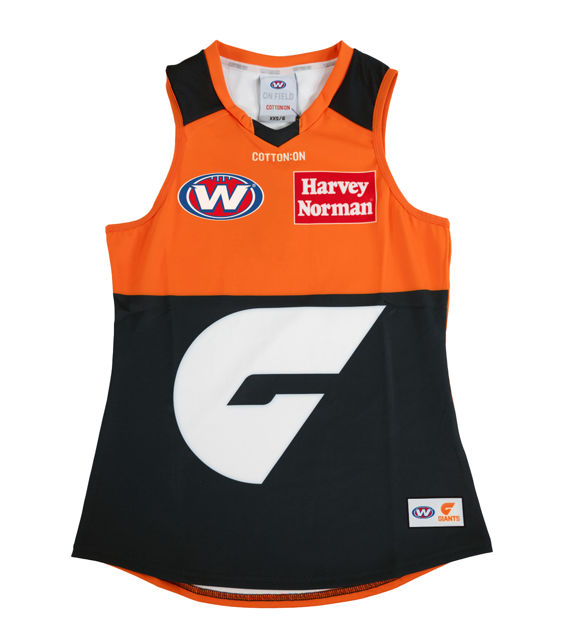
The logo type was replicated from the AFL logo and was developed by duplicating and rotating the original AFL ‘A’. This ensures the logotype shares the same character, slant, and serif style of the original inspiration. The letterform is bold and unapologetic, with a simple ‘W’ filling the entire ellipse container. The heavy weight strokes communicate strength and stability, while the slight right shear of the letterform increases dynamics, hinting towards progressive movement. The navy drop shadow follows the style of the AFL logo, and reiterates the strength and weight of the letterform. The navy strokes throughout aid in legibility at all scales by providing sufficient contrast and dimension. The ellipse container has remained identical to the AFL logo to aid in brand unity and recognition. Further, the brand colours have been retained to reiterate the national nature of the competition, lending credibility and impact to the AFLW brand.
This logo is a drastic improvement from the current AFLW logo, which reads as weak, meagre, and un-intimidating - completely unsuitable for a sport relying on physical strength, impact and athleticism.
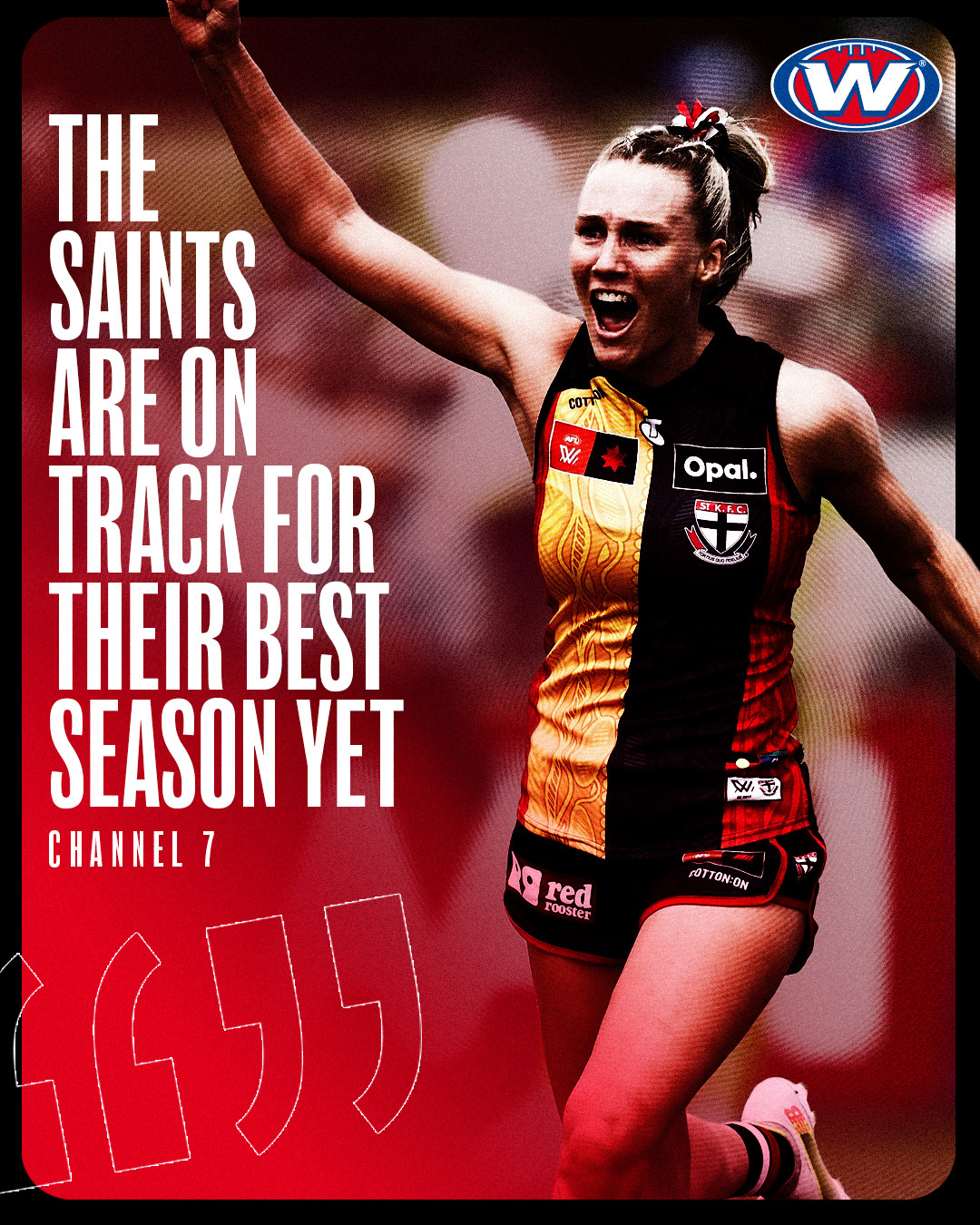
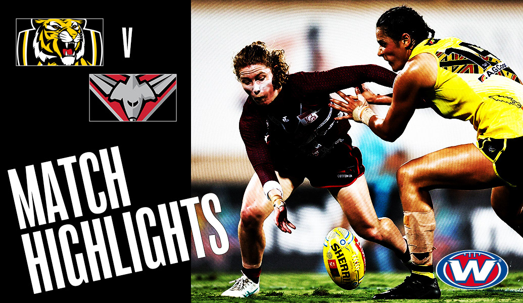
The image design styling represents the brand’s culture and personality by representing female athletes as real athletes. The high-contrast photo editing style uncovers the raw, gritty nature of the sport, creating a bold and loud brand representation. Photography is also treated with a subtle radial halftone surrounding the image’s subject, which adds a textural element to the composition and a visual reference to the energy, excitement and volume of live sport. Image colour and tone are complimented by gradient overlays, which offer both depth and bursts of colour to the composition. Using black as a foundation colour not only creates an underlying mood of professionalism, but enhances identifiable club colours, aiding in consumer navigation.
The forms within the photography define the type layout, creating dynamic and complimentary compositions that enhance the overall graphic potency.
Typography is clean, impactful and bold. The condensed sans-serif has become an industry standard, and its use lends credibility to the AFLW brand.
Compositionally, elements are often placed asymmetrically to increase dynamics, with care to balance the composition. Diagonal placements and elements ‘breaking the frame’, (e.g. match highlights title text extending beyond black background), adds movement and increases image dynamics.
Overall, the image styling feels professional, textural and impactful. The core design principles and layout techniques are derivative of the current AFL branding, ensuring brand alignment whilst retaining the AFLWs bold, off-kilter brand personality through asymetrical and skewed graphic placements. The integration of this brand refresh would be seamless, realistic and uplift the AFLW brand, ensuring all aims and objectives of this project are met.

itching for a rebrand?