album identity design
record packaging
CD packaging
merchandise design
poster design
This *concept* project reimagines Ethel Cain's Preacher's Daughter (2022) album identity to create a cohesive, emotionally resonant visual identity that reflects the deeply narrative and thematic content of the album, while offering fans meaningful, story-driven physical touch-points. My package of work contains vinyl packaging with a lyric sheet and poster insert, CD packaging with a booklet insert, and two merchandise options - a t-shirt and a novelty spoon.
concept and visual direction
The visual language of this project draws heavily on the album’s dark Americana, Southern Gothic aesthetic, with deep blue tones and grainy textures establishing mood and atmosphere. A strong focus on analogue creation methods - such as lino stamps, hand collage, cyanotype, and Riso printing - introduces layers of texture and rawness, contributing to the authenticity of the overall identity. These tactile choices also nod to traditional Southern religious and domestic imagery, themes deeply rooted in the album’s narrative.
the narrative grid
A recurring visual motif across the project is a collage of eight narrative tiles, first introduced on the vinyl lyric sheet insert and carried through every design touchpoint. These tiles serve as symbolic snapshots of the Preacher’s Daughter storyline, referencing key emotional and narrative moments from the album. The tiles are arranged in an interwoven layout, accompanied by an inverted version of the same design. This composition creates a sense of connection and storytelling - suggesting that each tile is part of a larger narrative rather than isolated events. The use of inversion adds a subtle layer of unease, echoing the album’s descent into darkness, and invokes an x-ray-like visual - a metaphor for introspection, confession, and the exposure of hidden truths.
upper row (left to right):
1. A lace doily symbolises the conservative, domestic setting that underpins much of the album’s Southern Gothic tone - rooted in tradition, femininity, fragility, and religious restraint.
2. This tile refers to “A House In Nebraska”, where Ethel reflects on the safety and love she found with Willoughby. The house featured in the image was the real-life inspiration for the track, and is actually known as the “Snow-Wasden House” in Georgia. This tile is framed in white, representing the purity and peace she felt during that chapter of her life - an emotional anchor she returns to throughout the album.
3. This tile juxtaposes lace and an image of Ethel awkwardly placed in the top-right corner, evoking discomfort. It visually represents the pressure to present a delicate, “preacher’s daughter” façade while internally navigating trauma and darkness - a turning point in the story.
4. Featuring a rosary laid over lace, this tile captures the suffocating influence of religion throughout the album. The iconography speaks to both devotion and entrapment, as Ethel’s spiritual journey oscillates between reverence and rejection.
lower row (left to right):
5. This tile references the track “Gibson Girl” and illustrates Ethel’s descent into addiction and exploitation. Overlaid images of drug paraphernalia subtly point to her time under Isiah’s control, when she is sold into prostitution - a moment of deep loss of agency and self.
6. Representing the track “August Underground,” this tile captures Ethel’s murder in the woods. The haunting forest image, surrounded by a dark blue border, evokes fear and finality. A warped lace motif to the left mimics cloud forms - signifying the spiritual transition in the next track, “Televangelism,” where her soul begins to ascend. The tile’s left-side placement and visual imbalance reflect the chaos and rupture of this climax.
7. Using multiple exposures and unbalanced cross imagery, this tile depicts Ethel’s inner conflict with faith. The layered symbolism and yin-yang-like layout suggest a duality - her wavering belief in God and the tension between salvation and damnation.
8. The final tile refers to the song “Family Tree,” particularly the lyric “Take me down to the river, and bathe me clean.” It evokes the desire for renewal and absolution. Framed again in white, the border signals a symbolic washing away of sin and the hope for redemption, even in the face of tragedy.
Together, these eight tiles build a powerful visual timeline - each fragment deeply embedded with personal, spiritual, and narrative significance. Their collective presence reinforces the emotional gravity of the album and the intimacy of Ethel Cain’s storytelling.
vinyl packaging
The vinyl packaging consists of a double gatefold format with two discs. Designed assets include the front and back covers, spine design, interior gatefold design, a folded lyric sheet insert, a poster insert and 4 centre vinyl labels.
The front cover retains the original album photo but is reimagined through collage and cyanotype-inspired treatment to deepen intrigue. A cross-shaped structure is embedded into the composition, and the eyes of the main subject were purposely inverted to create an unsettling, foreboding mood. The omission of text highlights the art direction and invites viewer interpretation. The back cover continues this visual narrative with a blurry, burned-lace cross motif, visually representing the tension between faith and fragility.
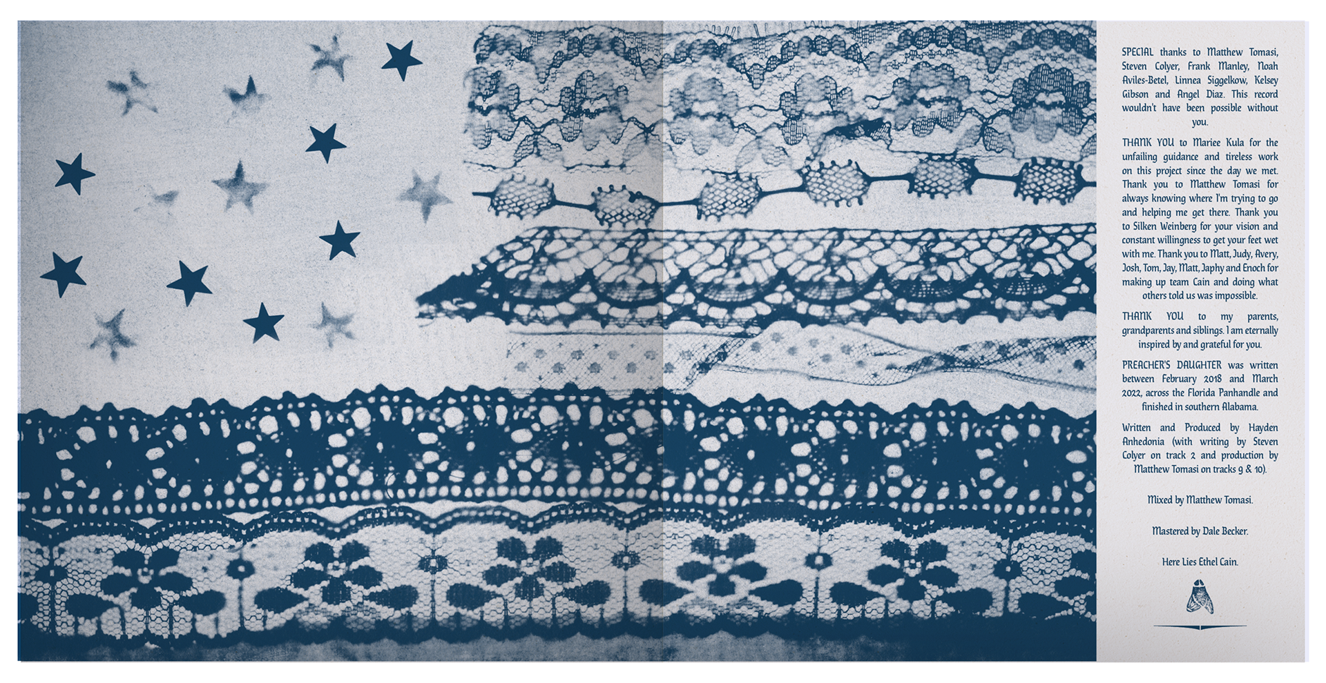
Inside, the interior spread forms a dark reinterpretation of the American flag. The stripes are created by various styles of lace, and the stars were created using sugar - the same method I used within the ‘Gibson Girl’ tile to represent drug use. This granular, semi-transparent appearance is referential to drugs like cocaine and heroin - a stark contrast between the fragility and conservatism of the lace imagery. This juxtaposition creates a powerful commentary on Southern identity, religious purity, and the nation’s contradictions.
The lyric sheet insert carries the Narrative Grid tiles on the back, while the front features a lino-stamped fly pattern - subtly referencing death and the album’s closing track “Sun Bleached Flies”. The poster insert emulates traditional prayer cards and features a crucifixion-style image of Ethel in a hayfield (taken by photographer Briscoe Park), with digitally engraved textures and Riso-printed for a soft, haunting finish. The text “God loves you, but not enough to save you,” another lyric from the final track, adds haunting context.
The vinyl labels are directly inspired by Catholic rosary charts. The diagonal text and heart shaped necklace positioning directly reference my inspiration, creating a connection to the culture through subtle reference. The album title is largely displayed within the stickers, creating a sense of drama and ownership for the viewer after layers of title-less visual assets, adding to the packaging experience.
front cover, poster, insert, 2x vinyls
back cover, poster, insert, 2x vinyls
front and back cover spread with spine design
interior spread
insert - lyric side
insert - grid side
poster insert - image credit: Briscoe Park
cd packaging
The CD packaging consists of the same front and back cover designs, two spine designs, a disc design and a booklet insert.
The disc design mimics a similar style to the record labels, and adapts the concept to a new format. A separate necklace cyanotype image was used, and on a diagonal angle, creating intrigue through an offset element. The phrase “Here Lies Ethel Cain” adds narrative weight and positions the music as a posthumous offering.
The insert booklet contains many of the same elements from the vinyl packaging, including the American flag cyanotype/credits on the opening spread, followed by lyric sheets of the same style. Relevant segments of the Narrative Grid are shown throughout the booklet, as snippets of the larger visual story.
CD case interior
CD case front and back with booklet
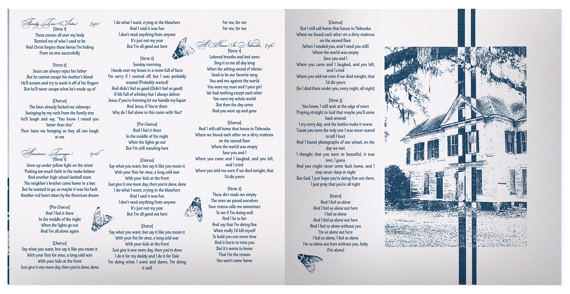
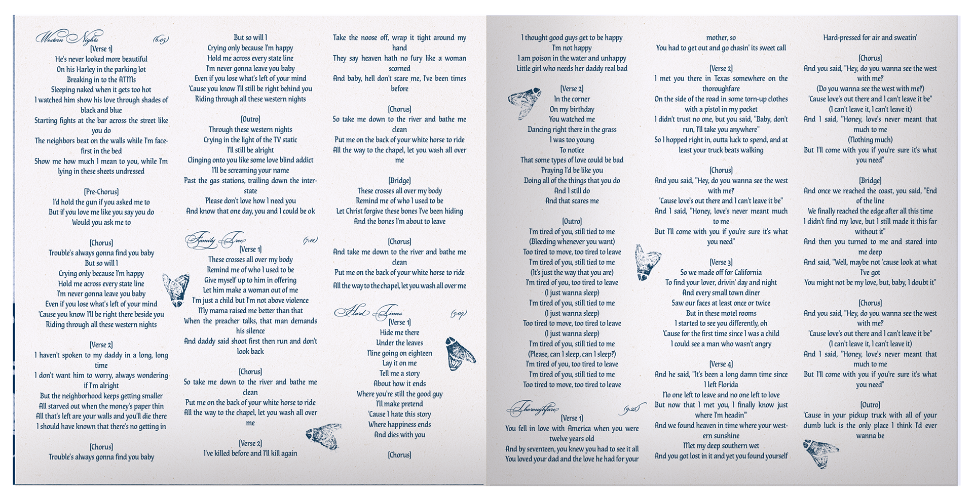
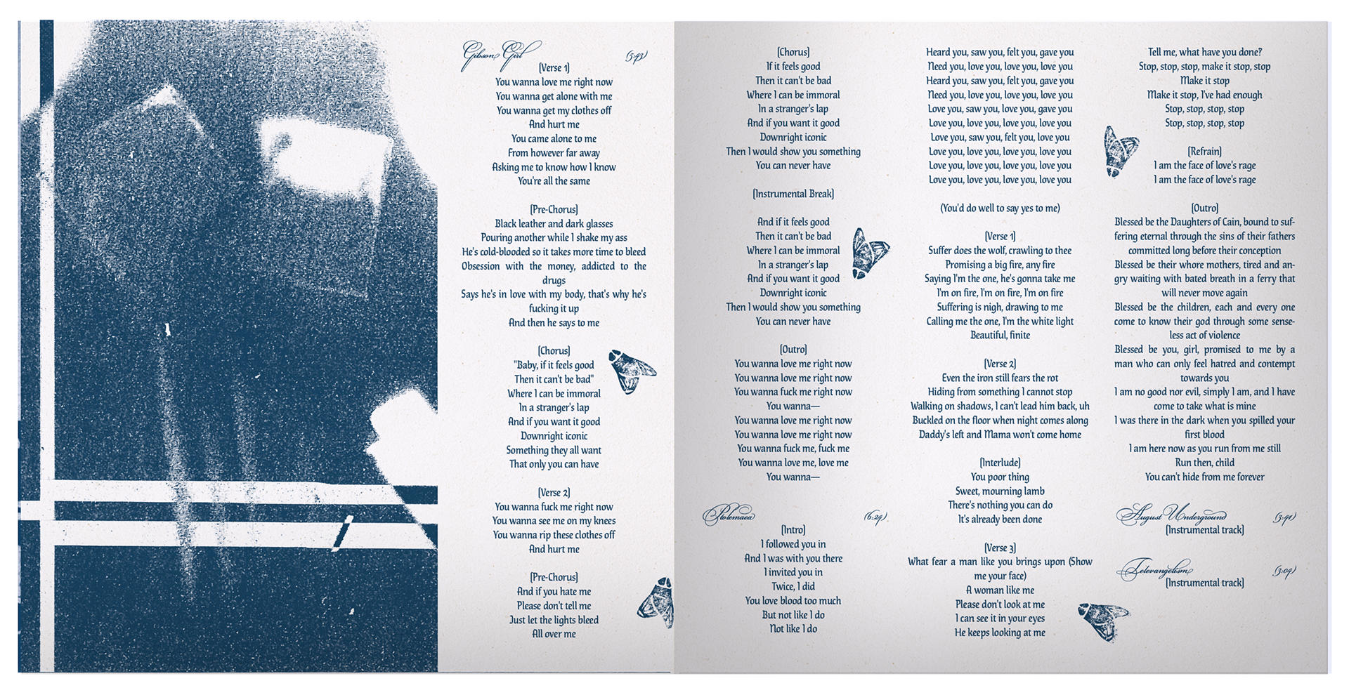
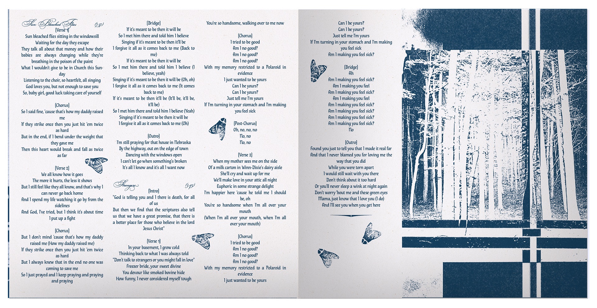
CD booklet spreads
merchandise design
The t-shirt features four of the eight Narrative Grid tiles, cropped for subtlety and intrigue. The shirt’s pinstripe pattern and button down style references Southern church attire, layering meaning into the garment’s form and aesthetic. The vintage, cream coloured napkin reinforces earlier themes of tradition and a classic American domestic setting. Natural fibers represent authenticity and further the raw, tactile nature of the creative direction.
With no explicit album or artist reference, the design fosters an exclusive “if you know, you know” connection with fans. The shirt’s vintage aesthetic, cropped button-up style and distressed, raw hem align with the style and values of Ethel’s target audience - young, alternative, often queer listeners who value fashion-forward, wearable merchandise with character and purpose.
The novelty spoon offers a niche, intimate merchandise moment. Featuring the image of “The House in Nebraska” - the only place Ethel ever felt love and safety - it embodies the warmth and sorrow central to the album’s story. This small token brings us into Ethel’s world - her home - and invites us in for tea. This simple, novelty design has a large impact, and would speak directly to fans of the album, acting as both a symbol and artefact of Ethel Cain’s universe.
button up shirt - back
novelty spoon
make your album art dreams come true <3


