
logo design
brand identity
rebrand
brand collateral
poster design
campaign design
This project displays two conceptual rebrands for the Royal Botanic Gardens Victoria. Both concepts aim to restore the charm and character currently lacking from the Garden's visual identity. The concepts aim to visually represent the feeling of awe and admiration commonly experienced when visiting these marvellous gardens - connecting the designed identity to place and customer experience.
concept one - the illustrative approach.
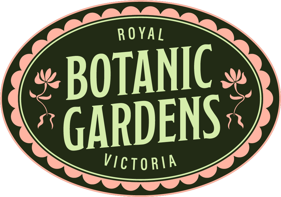
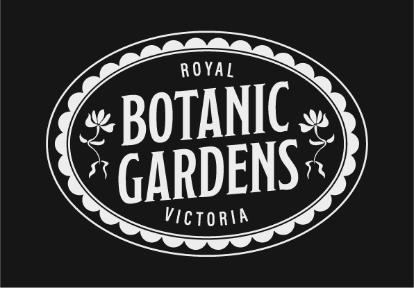
Concept one’s logo draws on the sensory experience of the Royal Botanic Gardens Victoria, combining historical influence with natural authenticity. Its forest green, mint, and watermelon palette was sampled directly from my own botanical photography from within the Gardens, grounding the design in place while evoking freshness. The silhouette references gardening culture - part fruit sticker, part flower petal - while the central ellipse symbolises community and gathering.
Inspired by 1890–1910 graphic artefacts, ornate borders and floral decals bring personality and heritage, repositioning RBGV with greater cultural confidence. Typography reinforces this tone: tall, condensed uppercase serifs nod to early advertising, paired with lighter sans-serif framing for balance and breathability. The result is a confident, historically rooted mark that feels both elegant and alive.
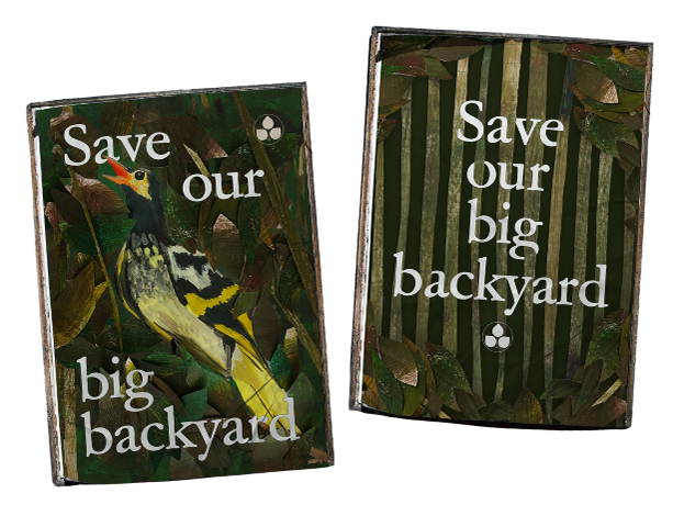
The poster series embraces a bold, illustration-first style, subverting their current government-brand aesthetic. A reduced three-tone palette nods to historical print methods, whilst uniting the suite and creating high impact. Centralised logos are surrounded by abstract Art Nouveau-inspired motifs representing flora, trees, and wildlife—each symbolising biodiversity and community. The compositions convey sanctuary, protection, and shared appreciation, positioning the Gardens as a cultural haven. The bold focus on illustration and playful photo treatment gives the identity a distinct, expressive voice, capturing the awe and richness of the Gardens while demonstrating strategic brand design.
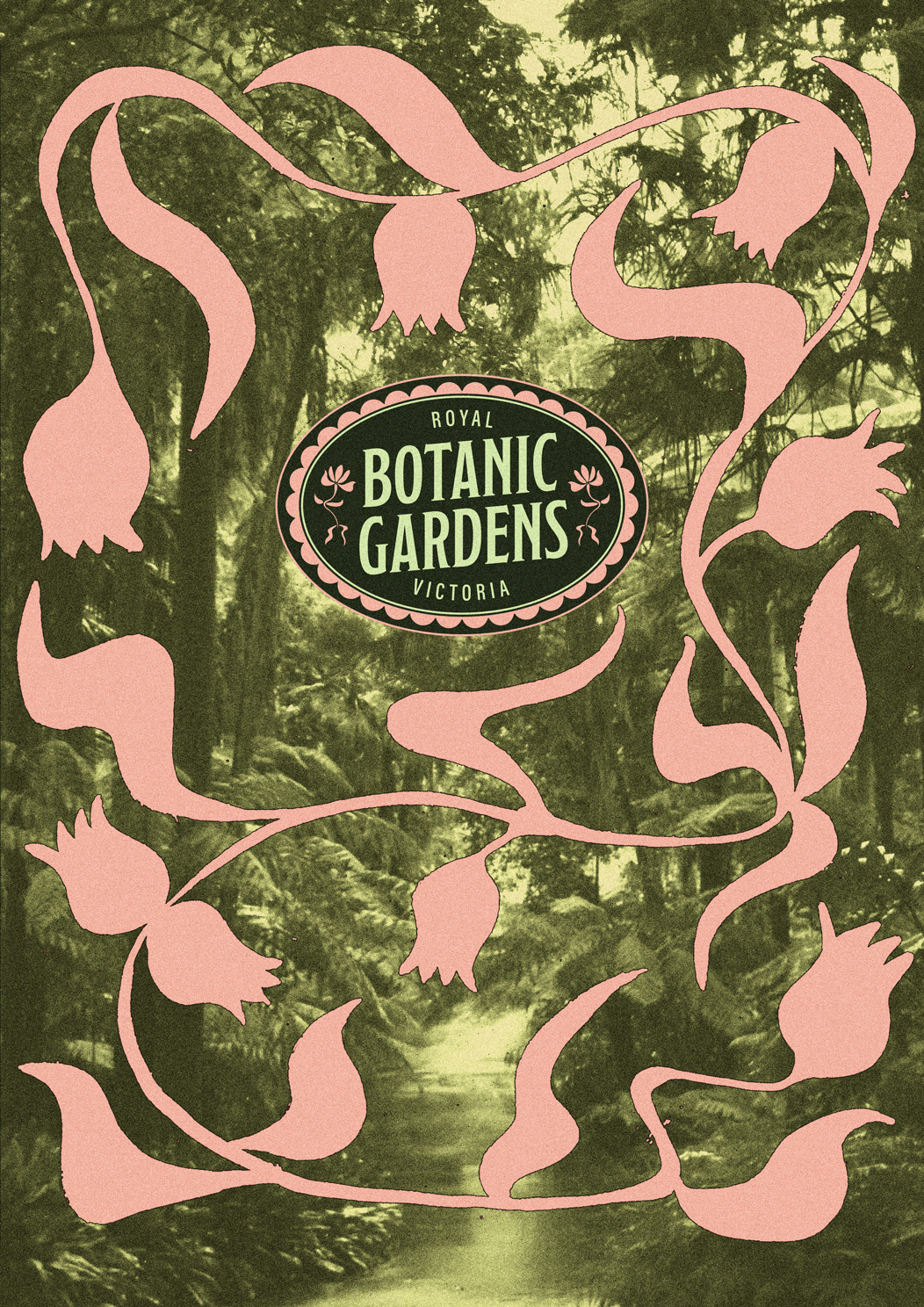
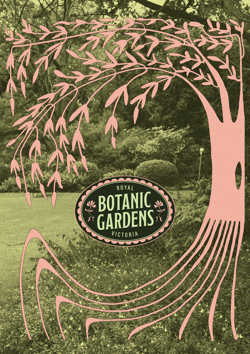
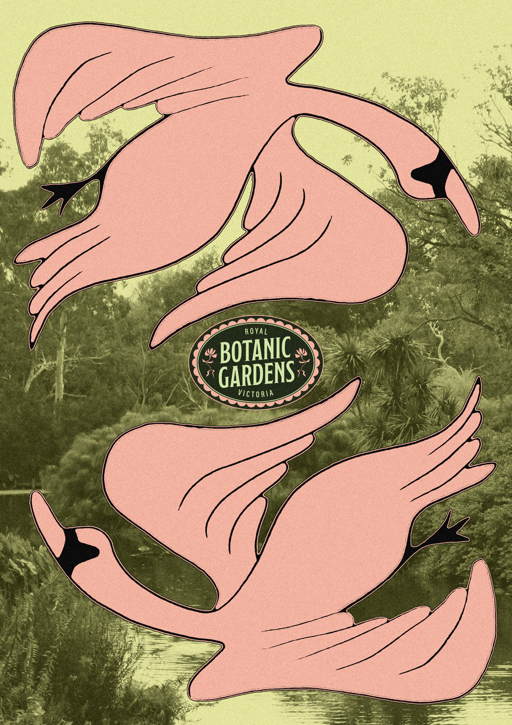
all images and illustrations are my own work
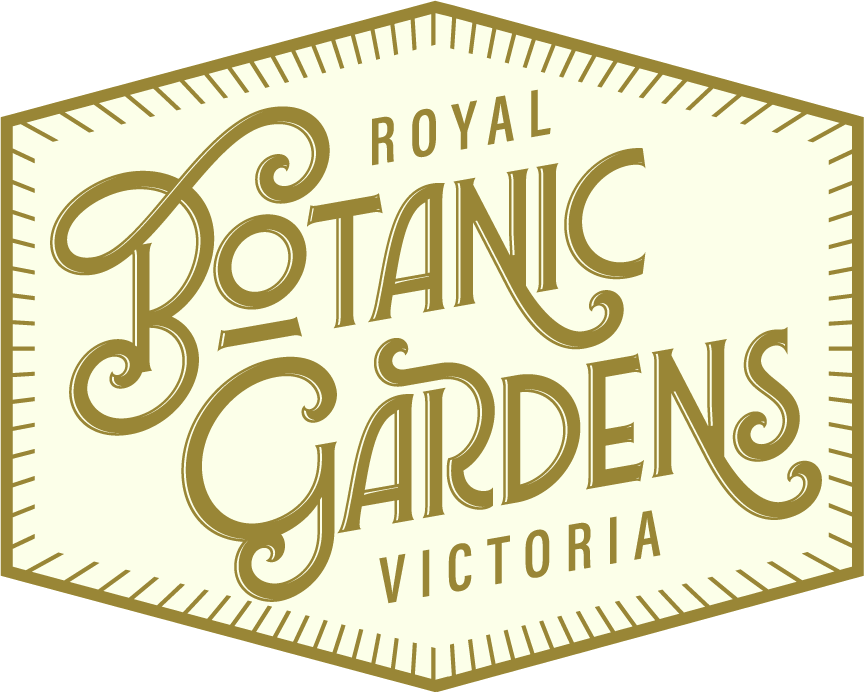
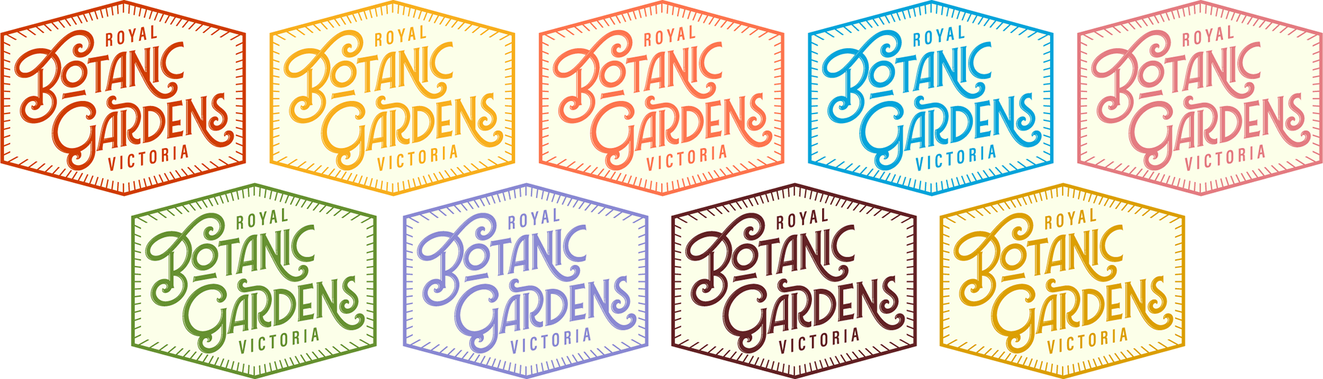
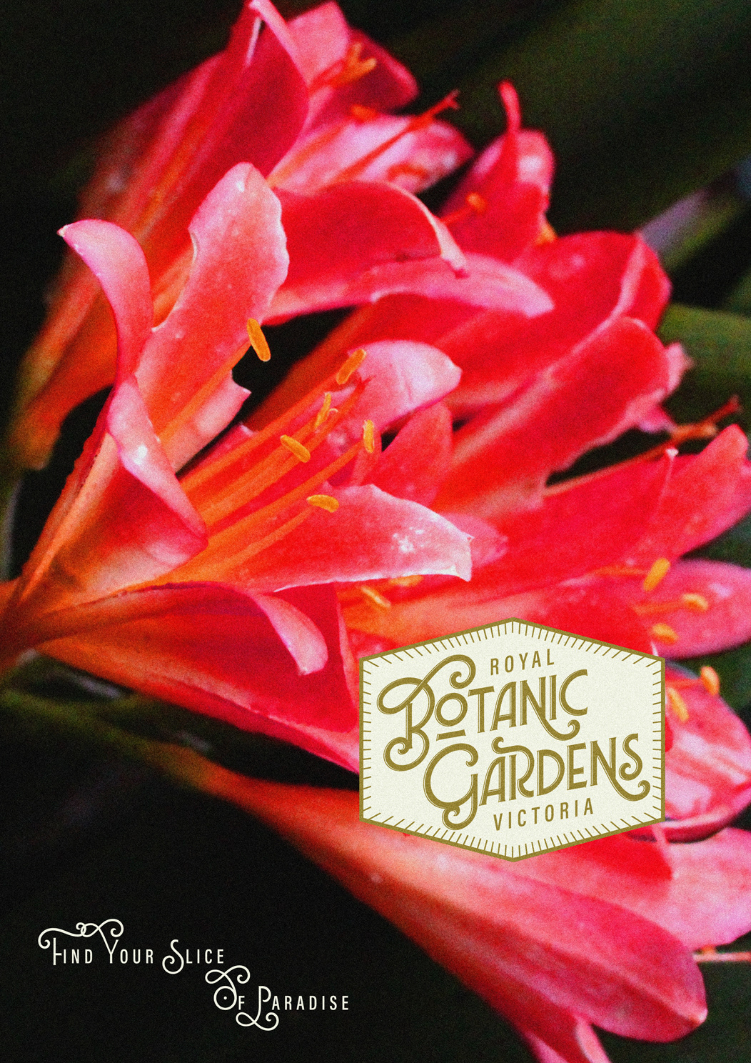
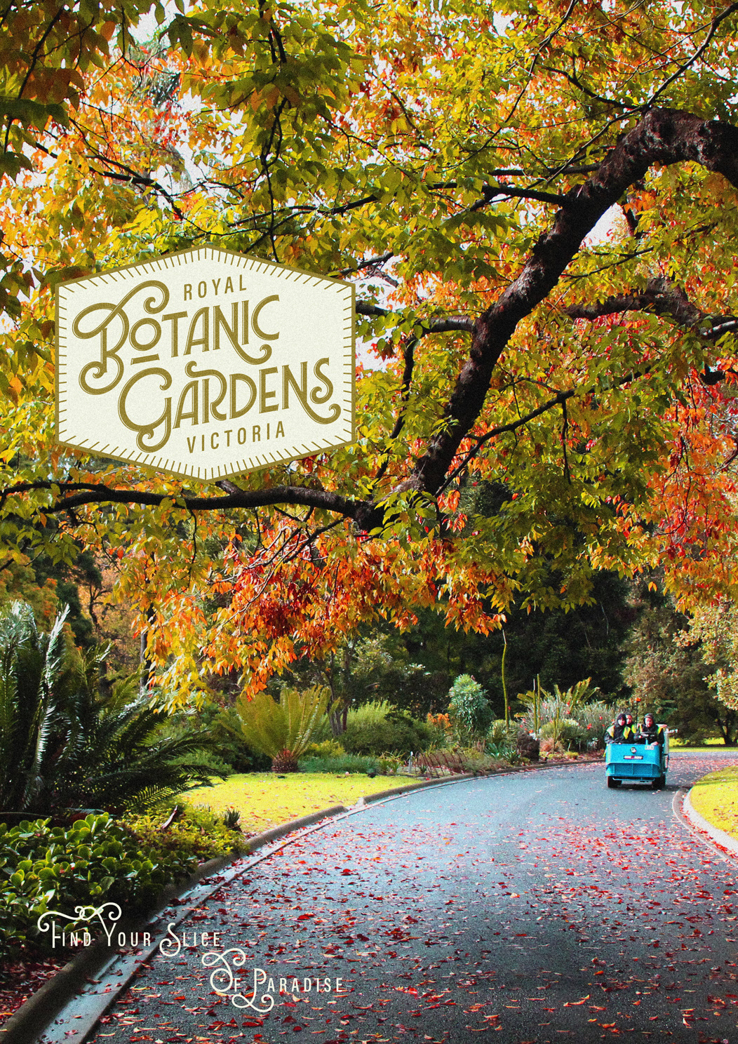
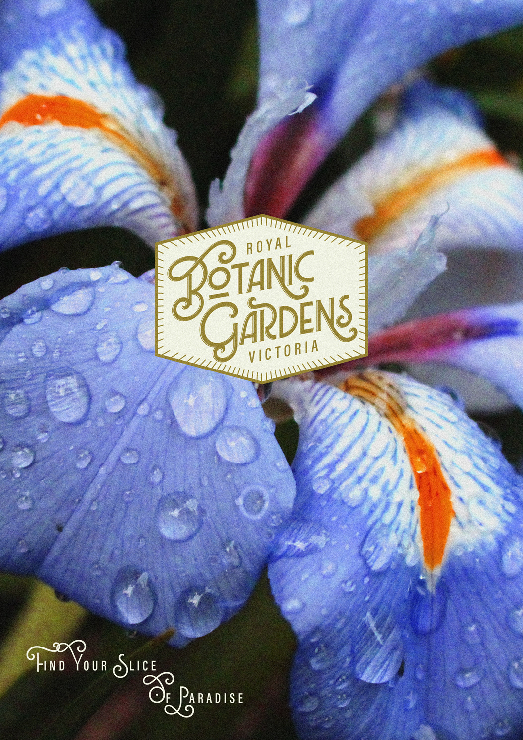
concept two - the photographic approach
Concept two offers a contemporary, adaptable identity anchored in a honeycomb form - symbolising natural structure, collaboration and community. The shape provides symmetry and containment, while acting as a visual metaphor for the Gardens as a central hub for cultural and botanical appreciation. Radial sunray-like borders add energy and draw focus to the ornate central logotype, set in a decorative geometric script that mimics organic movement. Bronze and cream colours convey prestige, with flexibility for seasonal variation. The contrast between expressive central type and light sans-serif framing ensures hierarchy, clarity, and rhythm, resulting in a flexible mark that remains recognisable across contexts.
This photographic-based poster series captures the Gardens’ diversity through a mix of sweeping landscapes and macro botanical details, edited with bold, dreamlike vibrancy. The logo shifts position fluidly between compositions, often framed naturally by surrounding elements, reinforcing its integration into the environment. A shared tagline - “Find your slice of paradise” - anchors each layout, combining ornate and airy letterforms to balance richness with freshness, mirroring the Gardens’ biodiversity. Playful, evocative and consistent, the series invites emotional engagement while presenting a flexible, visually rich identity that elevates RBGV as a cultural landmark.
all images are my own work
itching for a rebrand? or in need of some impactful campaign visuals?